
My first exposure to defence economics came from a wonderful book called
The Cost of Sea Power by Phillip Pugh. Among its many insights was a clever way of displaying the relative defence efforts of countries—see the yellowed picture above. By graphing both GDP and defence spending on logarithmic axis, Pugh managed to compare the economies and defence spending of nations large and small. (Without logarithmic scales, the graph collapses into a jumble of points near the origin, with the United States pushed off in the upper right-hand corner.)
The lines at 45% to the axis represent constant ratios of defence spending to GDP. As you can see, most countries in the sample spent between 2% and 6% of GDP on defence back in 1982 when the data for the chart was collected.
I’ve produced a similar chart for the annual
ASPI Budget Brief (see chapter 5) since 2006, including data on more than 140 countries. The pattern remains the same as it was in 1982, except that most of the data now fall between 1% and 4% of GDP. The downward shift presumably reflects the peace dividend following the end of the Cold War.
Like Pugh’s graph for 1982, my more recent versions are static snapshots. But as economies grow, you’d expect the data points to move upwards and to the right—defence spending grows as GDP grows, all other things being equal. In effect, the boundaries of 1% and 4% of GDP delineate a racetrack upon which most countries are moving. Some will move faster than others due to more rapid economic growth, and some will veer towards higher or lower GDP share as their strategic and financial circumstances change.
Using the
SIPRI military expenditure database, I’ve captured the action on the track for the period since the end of the Cold War for selected countries. Here are the results.
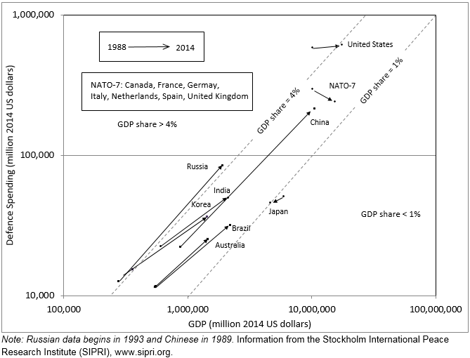
Although shifts in exchange rates affect the results for most countries, I believe that the picture broadly captures a number of key strategic trends (with the caveat that the Russian data commences in 1993, well after the end of the Cold War). Three things are immediately clear.
First, the emerging economics of the BRICs (Brazil, Russia, India and China) and South Korea have all experienced strong economic growth which has allowed commensurate (i.e. at a constant proportion of GDP) growth in defence spending.
Second, non-US NATO countries have experienced relatively slower economic growth while substantially reducing their defence effort (as measured by GDP share) since the end of the Cold War.
Third, the US still spends a lot more on defence than any other nation, but its defence effort has lessened from Cold War levels—much like their European allies. Japan’s defence effort has strengthened from 0.9% to 1.0% of GDP, but in terms of US dollars its economy and defence expenditure has fallen (due to sluggish growth and depreciation of the yen).
Australia’s economy and defence spending have grown strongly compared with other Western countries. In part, this reflects an appreciation of the Australian dollar. More importantly, our defence effort towards the end of the Cold War was relatively modest (~2% of GDP) compared to our allies. That is, although we’ve more-or-less maintained our defence effort, it was and remains at a low level in terms of GDP share.
Returning to the racetrack analogy; emerging economies—and especially China—are flying down the track while our friends and allies are pulling into the pits. The race isn't over, and the logarithmic scale distorts the gap between emerging economies and the established powers. In effect, ‘objects in the rear view mirror appear closer than they actually are’ on a logarithmic scale. Nonetheless, it still looks to be only a matter of time before the reigning champion is overtaken.
 Print This Post