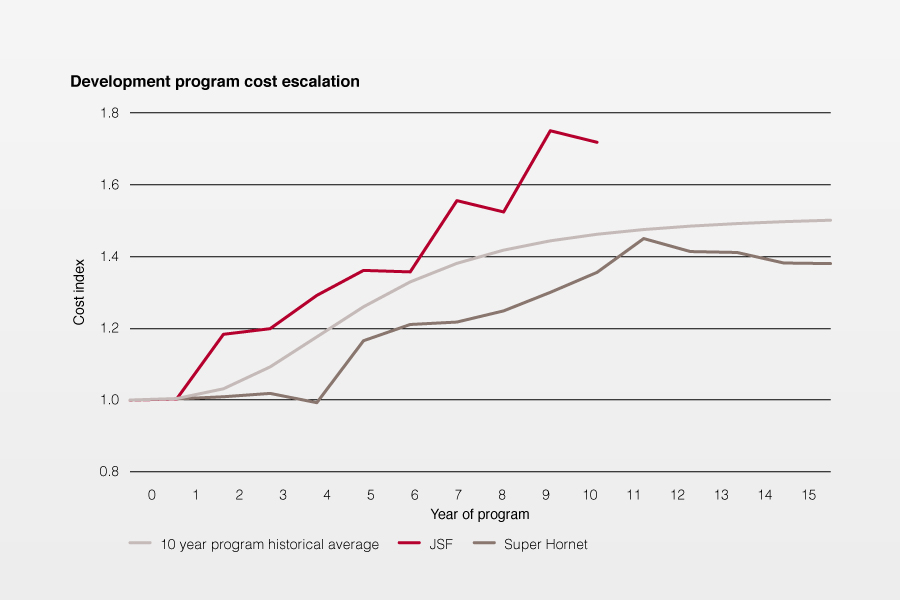
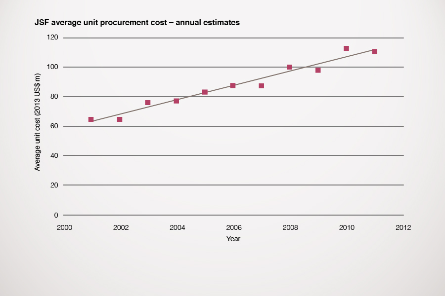
This week’s graph is an update of analysis started by ASPI in 2006. Drawing on annual figures published by the Pentagon, it analyses the real cost growth in the projected cost of the F-35 Joint Strike Fighter (JSF).
The first graph (click to enlarge) is the raw figures of the projected average aircraft cost, adjusted for inflation. It’s not a pretty story. But it’s hard to tell from this figure whether this is anything out of the ordinary.
A bit of extra tweaking allows us to compare the cost growth in the JSF with the average for large American defence programs, and with another aircraft program—the development of the Super Hornet—which is generally regarded as an acquisition success story.
This is the same JSF data as in the graph above, but this time plotted as an index (in red, click graph to enlarge).The average historical performance of US weapon programs is in black and the Super Hornet program is in brown.
This all suggests that, while the JSF might yet prove to be a winner, it’s been a harder than average slog so far.

Source: US DoD Selected Acquisition Reports 2001–2011 for JSF and Super Hornet data. The curve for the historical average performance is derived from data in Norman R. Augustine’s Augustine’s Laws (1983).
Andrew Davies is senior analyst for defence capability at ASPI and executive editor of The Strategist.


